Getting Started with Custom Branded Packaging
Ordering custom branded packaging doesn’t have to be complicated — even if you’ve never worked with packaging, dielines, or print files before.
This guide explains:
- What’s needed to get a custom branding project started
- How packaging artwork differs from standard marketing design
- Common pitfalls (and how to avoid them)
- How Unipak helps make the process smooth and predictable
You don’t need to be a print expert. That’s our job.

Who this guide is for
This guide is for:
- Café owners and operators
- Marketing managers and brand leads
- Anyone ordering custom branded packaging for the first time (or first time in a while)
If you’ve ever wondered “Is our artwork good enough?” or “Why does packaging have so many rules?” — you’re in the right place.
Free Custom Branded Packaging Guide
Download our practical, printable guide to have details on hand or share with your team. By submitting the form you will be added to our mailing list, you can unsubscribe at any time.
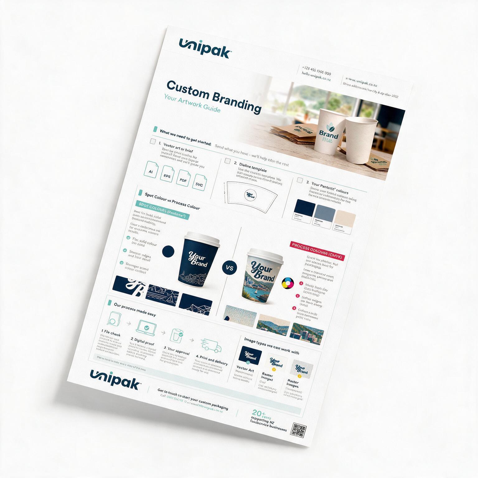
The three things needed to start a custom branding artwork
Most custom packaging jobs start with the same three inputs. Don’t worry if you don’t have everything perfectly prepared, we’ll guide you through it.
1. Your artwork - or a clear brief
Best option
- Vector artwork (AI, EPS, or vector PDF)
Also fine
- A written brief if artwork isn’t final yet
Why this matters
Packaging is printed, cut, and folded. Vector artwork ensures logos and text stay sharp and consistent at any size.
If you’re unsure what format your files are in, send them anyway. We’ll review them and let you know what works and what needs adjusting.

2. A dieline for your product
A dieline is the technical template that shows:
- Where the packaging is cut
- Where it folds
- Where glue or seams sit
- Printed artwork to include on the final product
You can:
- Use a dieline we supply, or
- Provide an existing dieline if you’ve printed this product before and need an exact copy or specific shape.
Why this matters
Without a dieline, artwork can’t be positioned correctly. Small placement issues can affect how the final packaging looks or fits.
Creating dielines isn’t something customers are expected to do. Unipak have dielines for each custom printable product, and then add your artwork on top — this is a normal part of the packaging process. Think of them as blueprints for your project.

3. Your brand colours (Pantones if available)
If you know your Pantone colours, share them with us.
If not, send:
- A brand guide
- A website link
- Previous printed packaging or samples
Important note
Most packaging uses uncoated Pantone colours, because packaging materials are uncoated and absorb ink differently.
If your brand guidelines only list coated or digital colours, we’ll help translate them into packaging-friendly equivalents.

Vector vs raster artwork (in plain English)
One of the most common issues we see is logos that look fine on screen but don’t print well on packaging. The best way around that is to make sure you use vector artwork.
Vector artwork (recommended)
- AI, EPS, or vector PDF
- Scales infinitely
- Crisp edges and clean text

Raster artwork (not encouraged)
- PNG, TIFF, or JPG
- Made of pixels (tiny square-like blocks of colour)
- Can appear blurry when enlarged
Quick check:
Zoom in very closely.
- Sharp edges → likely vector
- Blocky or fuzzy edges → raster
For packaging, logos should almost always be vector.

Why full-colour printing is usually not recommended
Many customers expect to use full colour (CMYK) because it’s common for menus and marketing materials.
Packaging is different.
On uncoated or kraft materials:
- Colours can look flatter or muddier
- Gradients and photos can lose detail
- Colour consistency is harder to control
The most common reaction we hear:
“It doesn’t look like it did on screen.”

What usually works best for packaging
For most café and foodservice packaging, we recommend:
- 1–2 spot colours (Pantone)
- Clean logos and typography
- Strong contrast designs
- Simple, intentional layouts
Why this works
- More predictable results
- Better consistency across print runs
- Faster approvals
- Packaging that looks confident and premium
How the Unipak process works
Our role is to guide you through the technical parts so you can focus on your brand.
Our process
- You send what you have
- We review and pre-flight your files
- We flag any risks early (colour, resolution, layout)
- You approve a proof
- We print and deliver
What you can expect
- No printing without approval
- Clear guidance, not jargon
- Honest recommendations based on materials and use
Common questions
Do I need finished artwork to get started with a custom branded packaging product?
No, a clear brief is enough to begin, but the process is always much faster when you have design elements in high quality vector format and colour references ready along with your idea.
Can you match our brand colour?
Yes. Pantones and physical references give the most reliable results on packaging.
Will you check our files before printing?
Yes. Every custom branding job goes through a pre-print review process.
Ready to get started?
If you’re unsure where to begin, reach out and talk to our team.
We’ll guide you through the rest — and make sure your packaging looks right before anything goes to print.
Other useful resources
- What is a Dieline?
- Full Colour vs Spot Colour
- Understanding different colour spaces
- Vector vs Raster Artwork Explained
- Custom Branding Checklist (Download)